Shelfion
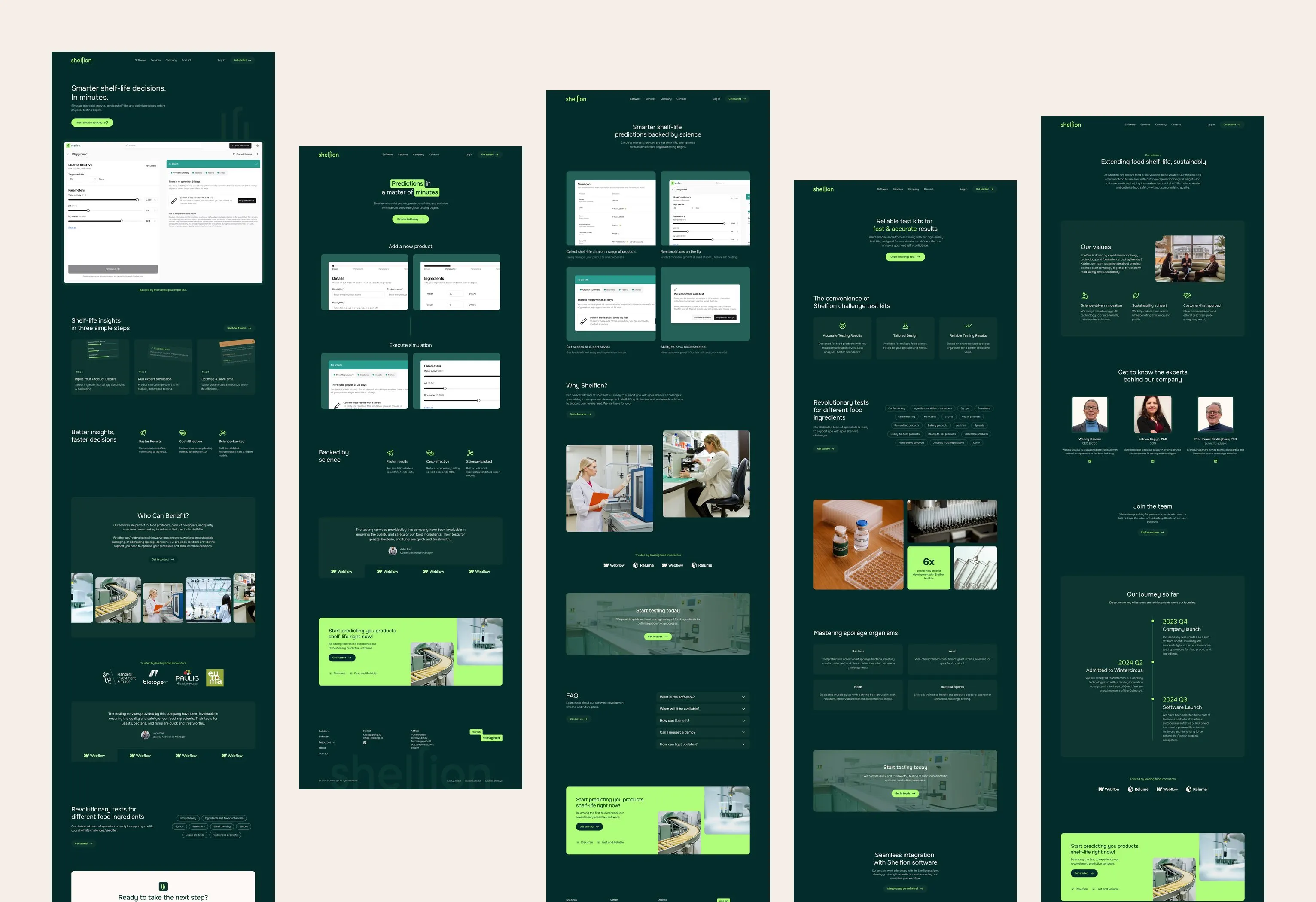
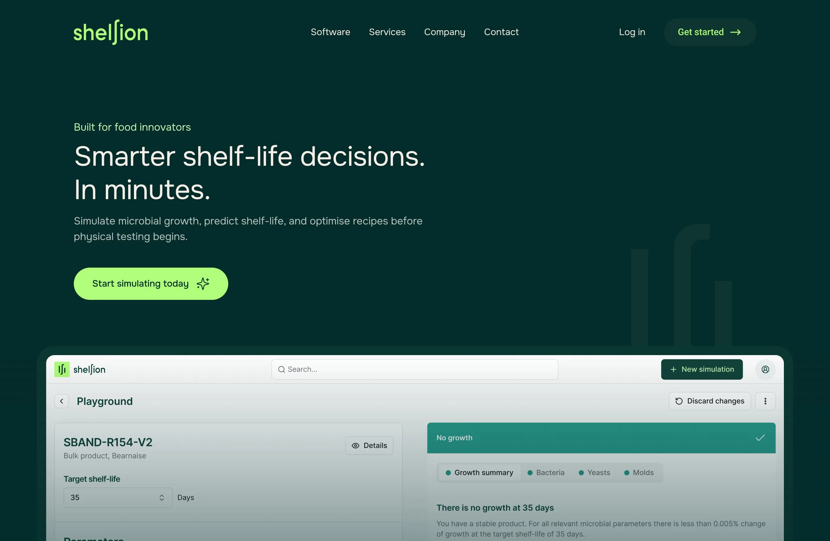
Shelfion, formerly I-Challenge, predicts the shelf-life of food products in minutes instead of months of lab testing. Its software runs on validated microbial growth models, backed by test kits, its own laboratory and consultancy. I was involved from the name onwards, designed the brand, the logo and the website, and helped shape the early version of the software.
www.shelfion.com- Branding
- Webdesign
From I-Challenge to Shelfion
The company started out as I-Challenge, after the challenge tests its lab runs on food products. As it grew into software that predicts shelf-life, the name had to evolve as well. Together we landed on Shelfion: short, ownable, and built on the shelf-life every customer comes for.

A mark made from the ‘f’
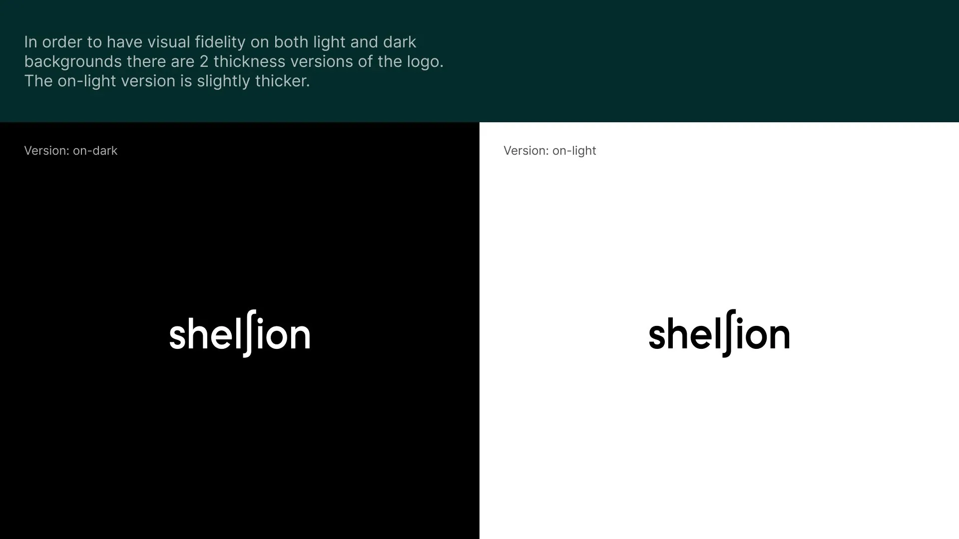
The f in the word mark carries the identity: its upright strokes stand on their own as the app icon and the favicon. A bright, almost electric green gives the product one colour that always means Shelfion. As a bonus the ‘f’ refers to the mathematical function used in their prediction algorithms.